
·
BASICS
·

Marketing Lead
Every day, thousands of presentations are created worldwide. The vast majority of them look… fine. Functional. Forgettable. And increasingly, a growing number of those are being generated by AI tools that promise professional results but deliver something that feels flat, repetitive, and unmistakably machine-made.
If you've ever used an AI presentation maker and thought "this doesn't look like something a designer would make," you're not imagining things. There's a real, measurable gap between what most AI slide generators produce and what a skilled designer creates. That gap isn't about taste. It's about a specific set of design decisions that most tools ignore entirely.
At Alai, we’ve spent a long time trying to close that gap. We started by doing something deceptively simple: we watched what professional designers actually do. Not the tools they use or the templates they pick, but the decisions they make. What are the core dimensions they play with? Why does their work feel next level compared to that of a non-designer? And how much difference do those choices really make?
Here's everything we learned, and how we've started encoding it into our AI.
Why Do AI-Generated Slides Look Generic?
Before diving into what makes slides look great, it's worth understanding why most AI presentation tools produce mediocre results. The problem isn't intelligence. It's the principles they’re built on.
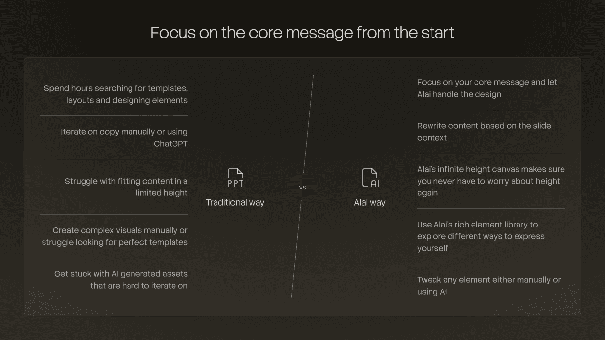
Most AI tools work backwards. Instead of designing a layout around your content, they take your content and fit it into a layout that already exists. The spacing, the positioning, how elements relate to each other - all of that is baked into the template. You have almost no control over it, and neither does the AI.
This is why designs start looking repetitive once you’re on the 3rd or 4th deck. The content changes, but the visual DNA stays identical. Uniform margins. Same text widths. Same card layouts. Same spacing between elements. Change the color from blue to green and you have a "new" theme, but the templated structure remains.
The result is what we call the "AI deck uncanny valley": slides that are polished enough to not look terrible but generic enough that you feel like something is missing.
Professional designers work differently. They don't start with a template and fill it in. They start with the content and design around it, making dozens of micro-decisions per slide about space, emphasis, rhythm, and detail. Those decisions are what most AI tools skip entirely.
The 4 Design Dimensions That Separate Professional Slides From AI-Generated Ones
After studying thousands of designer-made presentations and comparing them to AI-generated outputs, we identified four core dimensions that separate professional slides from AI-generated ones. Here’s what we found:
1. Intentional Use of Space
This is the single most overlooked aspect of slide design, and arguably the most impactful.
Professional designers use space intentionally. They create rhythm, focus, and emphasis by controlling how much room each element gets. Unlike AI tools like Gamma and Beautiful AI, they don't rely on uniform padding everywhere. Paragraphs don't always span the full width of the slide. Elements are placed differently depending on what the slide is trying to communicate.
Why most AI tools get this wrong: In tools like Gamma, Beautiful.ai, Canva, and most others, the layout grid is essentially fixed. The AI and the user have little to no control over spatial relationships between elements. Every slide follows the same invisible grid: same margins, same text widths, same spacing ratios. This produces decks that feel monotonous even when the content varies dramatically.
This is one of the main reasons AI decks often feel repetitive and boring. No amount of color swapping or font changing can fix structural sameness.
What good space usage looks like in practice:
Title slides with generous whitespace that let a single statement breathe
Content slides where text blocks don't stretch to the full width, perhaps occupying only 60% of the slide with a visual element balancing the remaining space
Varying margin structures across slides to create visual rhythm throughout the deck
Strategic asymmetry that creates visual interest/hierarchy without feeling chaotic
Grouping related elements closer together and separating unrelated ones (the Gestalt principle of proximity)
Here are a few examples of how we’ve tried to incorporate these principles in designs created on Alai:
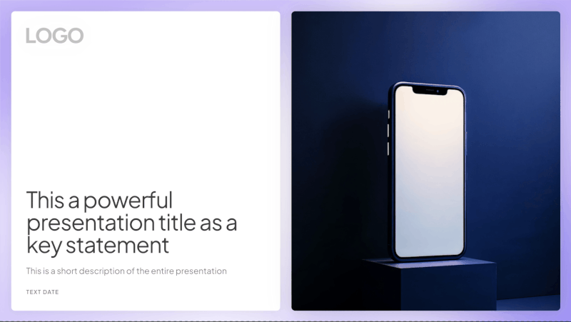
A title slide like the one below keeps the text on the left with plenty of open space around it, while the visual sits on the right. Neither side feels crowded, and the whitespace gives the headline room to land.
A comparison slide like the one below uses a clear vertical divider with balanced spacing on either side, giving each point room to stand on its own without competing for attention.
A transition slide like the one below positions a single sentence off-center, creating visual tension that draws the eye.
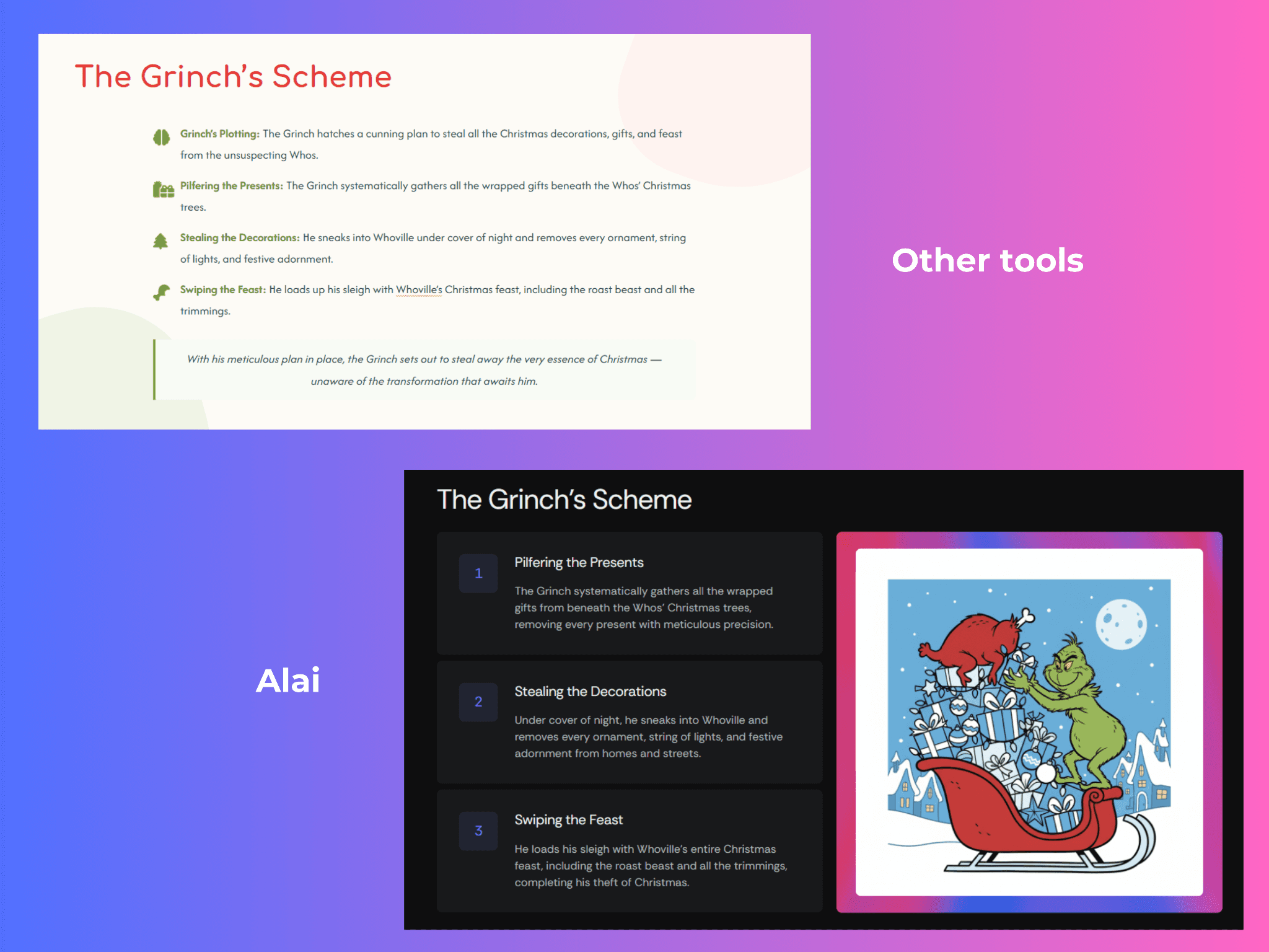
2. Depth Through Layering
Shadows, gradients, blur, and highlights create visual depth and emphasis. Without them, slides can look competent but rarely feel special.
Think about the difference between a flat card on a white background and one with a subtle drop shadow that makes it feel like it's floating just above the surface. Or a gradient overlay that draws the eye from left to right, reinforcing the reading direction. Or a soft background blur behind a text block that creates separation between layers of information.
These are small touches individually, but together they're the difference between "I made this in five minutes" and "wait, who designed this?"
Professional designers think in layers. A slide isn't a flat surface. It's a composition with foreground, midground, and background elements. Shadows establish which elements are "in front." Gradients create movement. Blur creates focus by softening what doesn't matter. Highlights draw the eye to what does.
Why most AI tools get this wrong: Depth effects are hard to parameterize, and risky. Bad shadows look worse than no shadows. Most AI presentation tools avoid this level of control entirely, which is why their designs often feel stuck in 2D. They produce slides that are technically clean but visually flat.
What good use of depth looks like:
Cards and content blocks with subtle, consistent shadow styles that create layering
Gradient backgrounds that shift tone gently, adding warmth or direction without being distracting
Background blur or dimming behind overlaid text to ensure readability while preserving visual richness
Highlight effects on key metrics or data points that make them feel "elevated" from the rest of the slide
Consistent depth cues across the entire deck, so the visual language feels cohesive
At Alai, we've worked on this by building depth into the design system itself. Our slides use layered card styles, visual grouping, and structured element placement to create separation between content blocks, so slides feel dimensional without the user having to think about it.
Here's an example of the same content built in a typical AI tool versus Alai:
3. Typography That Shapes Hierarchy
Font weight, letter spacing, line height, and typographic hierarchy can completely change how a slide feels. Typography isn't just about picking a nice font. It's about building an entire system that guides the reader's eye and establishes what matters most on every slide.
A bold 48pt heading with generous letter spacing communicates confidence. A thin, tightly-set body font feels elegant. The interplay between the two creates rhythm. When you see a slide where the heading feels weighty and the supporting text feels light, your brain automatically understands the hierarchy: what to read first, what to read second, what's the takeaway, what's the detail.
This is one of the hardest dimensions for non-designers because they often know something looks off, but can't pinpoint exactly what to change. Is the heading too big? Too small? Is it the font itself, or the spacing around it? Usually, it's a combination of several subtle typographic choices that are slightly out of tune.
The core typographic variables that designers manipulate:
Font size ratios: The size difference between headings and body text. A larger ratio creates more drama and clearer hierarchy.
Font weight contrast: Bold headings with regular or light body text, or the reverse for a more understated feel
Letter spacing (tracking): Wider spacing on headings for an open, modern feel; tighter spacing for body text to increase readability
Line height (leading): The vertical space between lines of text. Too tight feels cramped, too loose feels disconnected.
Font pairing: Combining complementary typefaces (like a geometric sans-serif heading with a humanist sans-serif body) to create subtle contrast
Why most AI tools get this wrong: Most AI presentation makers pick a font pair and apply it uniformly. They don't reason about the relationships between typographic elements, like how the heading weight should relate to the body weight, how letter spacing should vary by context, or how line height affects the feel of a text-heavy slide versus a minimal one.
Here's a few examples of how we've applied these typography principles in Alai:
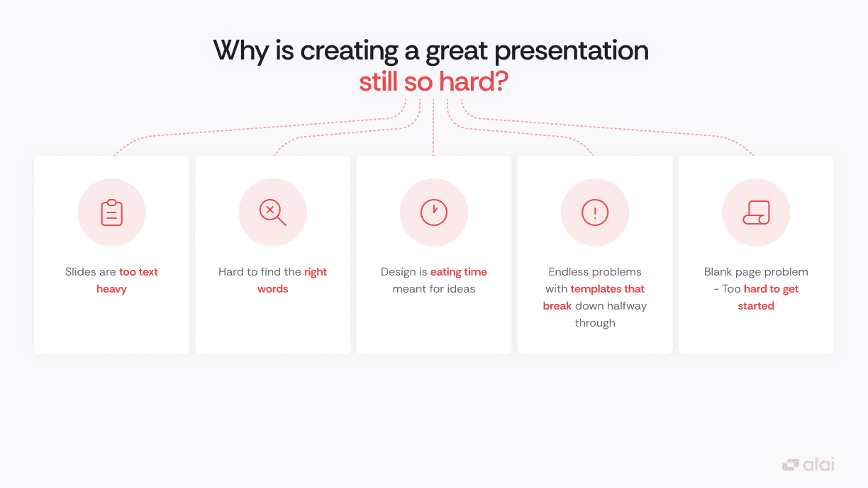
In the slide below, the heading does most of the heavy lifting through size and weight alone. "Why is creating a great presentation" is set large and bold in dark text, while "still so hard?" drops into red to draw focus. Inside the cards, key phrases are bolded in the same red, creating a secondary layer of hierarchy without adding clutter.
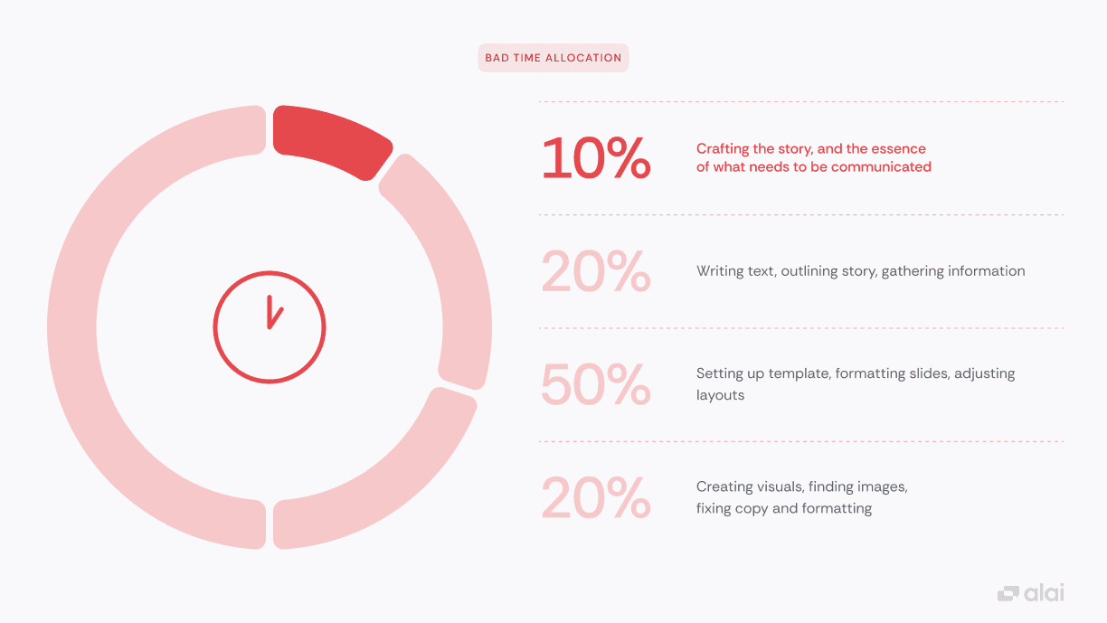
This next slide uses a dramatic size jump to establish hierarchy. The percentage figures are set oversized and light, making them the first thing your eye lands on. The descriptions beside them are smaller and darker, so you naturally read the number first and the context second. No icons or colors needed to tell you what matters most.
4. Obsession Over the Smaller Dimensions
Corner radius. Line thickness. Card styles. Icon weight. Divider styles. The way a border interacts with the text it contains. These details sound trivial, but they're what give a presentation its personality and coherence.
A serif font paired with sharp-cornered cards feels completely different from rounded cards paired with a soft geometric sans-serif. A 1px divider conveys something different from a 2px one. A filled icon has a different energy than an outlined one. Professional designers are constantly making these micro-decisions, ensuring that every element on the slide speaks the same visual language.
This is what gives a presentation its aesthetic signature. Two decks can use the same color palette and font pairing and still feel completely different because of how these smaller dimensions interact with each other and with the bigger decisions around space, depth, and typography.
Why most AI tools get this wrong: These details are the hardest to systematize. They require understanding how dozens of small variables interact to create an overall feel. Most tools either ignore them entirely (defaulting to safe, middle-of-the-road choices) or apply them inconsistently, which is actually worse than not applying them at all.
What attention to detail looks like:
Corner radii that are consistent across all elements and match the overall aesthetic (sharp for corporate/modern, rounded for friendly/approachable)
Icon styles that match the font weight and overall design language
Border and divider styles that complement rather than compete with the content
Card and container styles that create visual grouping without dominating the slide
Consistent interaction between all these elements across every slide in the deck
Here's how these details play out in practice on Alai:
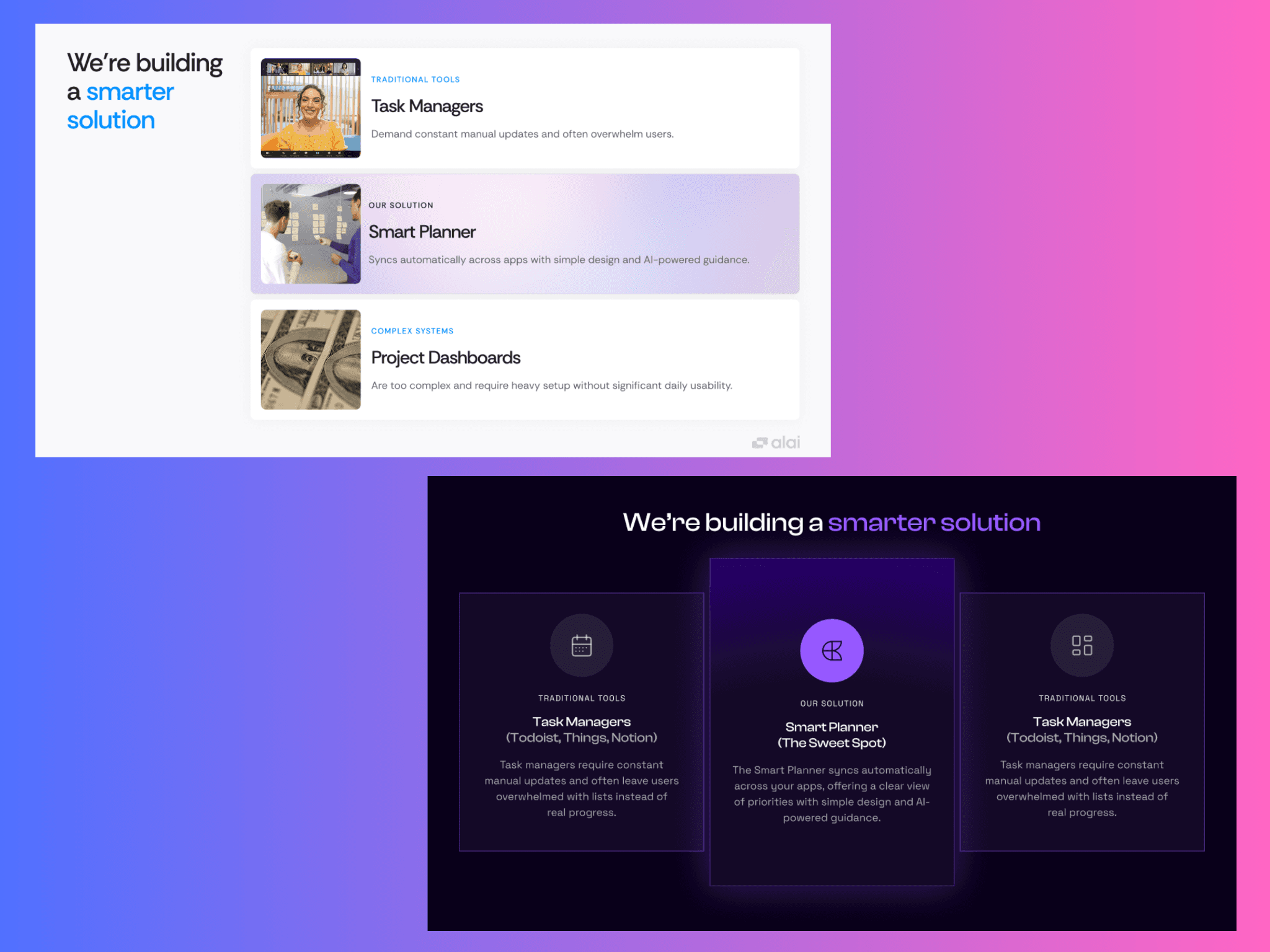
Both slides below were created on Alai with the same content. The light version uses rounded corners, image thumbnails, and soft gradient fills on the cards. The dark version uses sharp corners, outlined icons, and a more structured card layout with visible borders. Same information, completely different personality. That shift comes entirely from the smaller dimensions: corner radius, card style, icon treatment, and how they interact with the background and color palette.
What Professional Designers Do That AI Usually Doesn't
Beyond the four core dimensions, there are several process-level differences between how designers work and how most AI tools generate slides.
Designers iterate. They don't produce a finished slide in one pass. They create a rough version, evaluate it, adjust, try a different approach, compare, and refine. This iterative loop is where most of the quality comes from. Most AI tools generate everything in a single shot, which inevitably produces generic results and deprives users of testing different layouts before choosing the right one.
Designers think in decks, not slides. A great presentation has a visual arc. The opening slides might be bolder and more spacious. The content-heavy middle section might be tighter and more structured. The closing slides might return to openness. Designers create variety and rhythm across the deck. Most AI tools treat each slide as an independent unit.
Designers make context-dependent decisions. The right layout for a "problem statement" slide is different from the right layout for a "feature comparison" slide. Designers adjust their approach based on what the content is trying to accomplish. Most AI tools apply the same layout logic regardless of content type.
Designers break rules intentionally. Sometimes the most impactful slide in a deck is the one that breaks the established pattern: a full-bleed image after a series of structured content slides, or a single word on an otherwise empty slide. This kind of strategic rule-breaking creates emphasis and surprise. AI tools rarely have the judgment to know when breaking a pattern serves the narrative.
How We're Ensuring Alai Thinks Like a Designer
Understanding what makes designer-made slides better is one thing. Building those behaviours into an AI tool is a much harder problem. Here's how we've approached it at Alai:
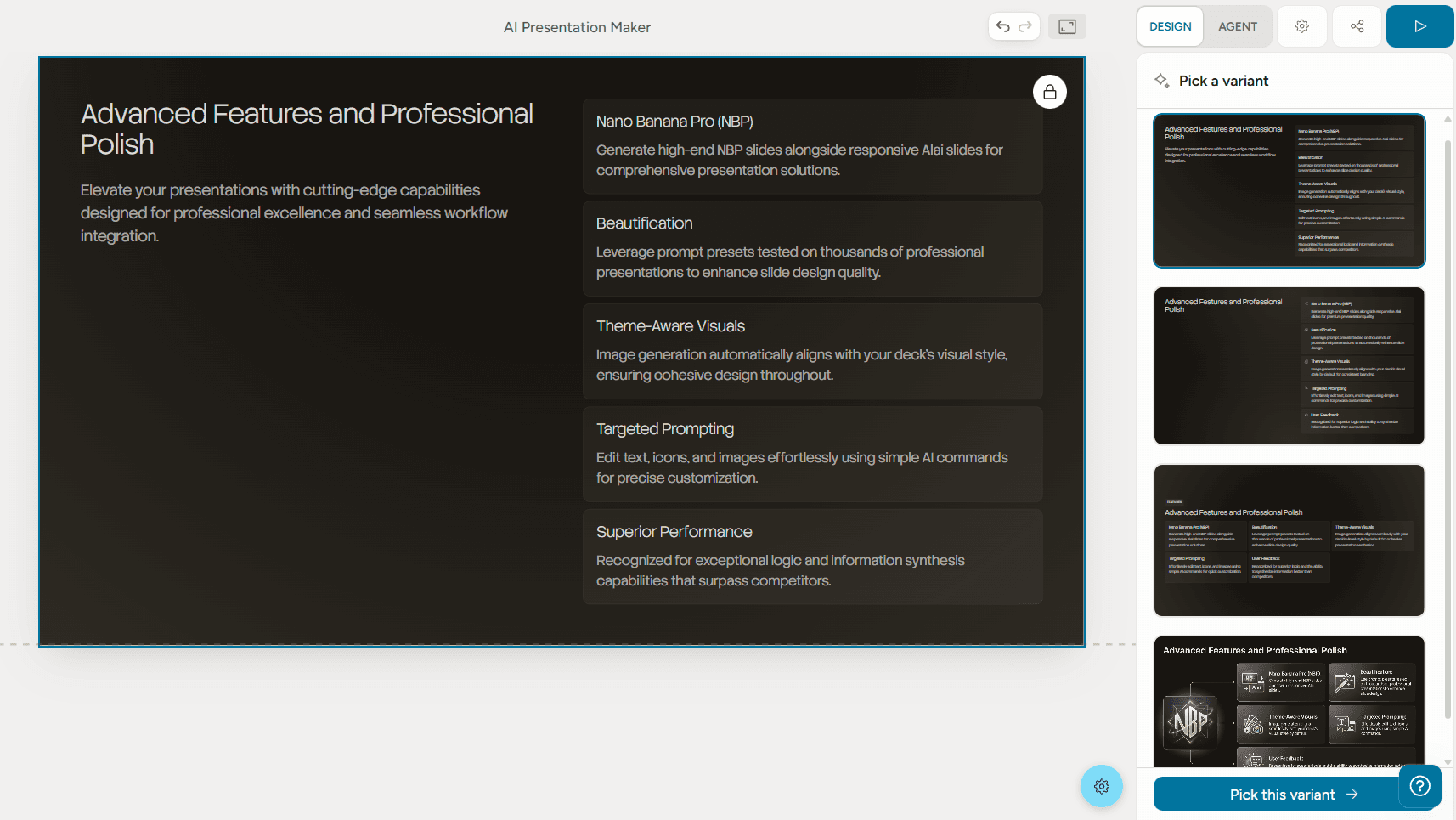
Multiple options, not a single guess. Designers rarely land on the right layout on their first try. They sketch out different directions, compare them, and pick the one that clicks. Most AI tools skip this step entirely and give you one output to work with. At Alai, we’ve tried to replicate this behaviour by providing four distinct options for every slide, each with a different approach to structure, spacing, and visual treatment. This makes the conversation shift from "how do I fix this" to "which one do I like most.”
Content-aware layout selection. Most AI tools apply the same layout logic regardless of what the content is trying to say. A problem statement gets the same treatment as a feature list. A comparison looks identical to a timeline. The layout doesn't match the intent, and the slide suffers for it. Alai has been trained on thousands of presentations to understand these differences. It reads the structure of what you're communicating and pulls from a purpose-built element library to match. Comparisons get a Compare Two layout built for contrast. Central ideas with supporting points get a Hub and Spoke structure. Feature breakdowns get a matrix that organizes information without overwhelming the viewer. Each content type has a dedicated element designed to present it clearly. This matters because the right layout doesn't just look better. It communicates better.
Deck-level awareness. Most AI tools generate slides in isolation, with no awareness of what came before or after. The result is a deck with no visual arc, no pacing, and no sense that the slides belong together. Alai understands the full context of your deck. It maintains visual consistency across slides (same design language, same spacing, same typographic rules) while still varying layouts enough that slide 12 doesn't feel like a copy of slide 3. It can also make smarter pacing decisions, like using a spacious layout for breathing room after a dense, data-heavy section. It thinks about your deck the way a designer would: as a cohesive story, not a collection of parts.
Built for iteration, not just generation. Getting to a great slide is rarely a one-step process, and Alai is built with that in mind. The AI gets you to a strong starting point, but it also gives you full control to refine from there. Tweak any element manually or with AI, reshape a layout, adjust spacing, or break the pattern entirely for emphasis. The goal is to handle the heavy lifting so you can focus on the last 20% that makes a deck feel truly yours.
Putting It Into Practice: Tips To Make Your AI Slides Look Better
Whether you're using Alai or any other tool, these are the principles that will get you closest to designer-quality output:
Start with content, not templates. Write out what you want to say first, even as rough notes. Then let the AI design around your content. If you're browsing template galleries before you know what you want to say, you're working backwards.
Iterate. Then iterate again. Treat the first generation as a starting point, not a finished product. Evaluate each slide: is the spacing working? Does the hierarchy feel clear? Does the deck have rhythm, or does every slide feel the same?
Vary your layouts. If every slide has the same margins and text width, the deck will feel monotonous no matter how good the content is. Let title slides breathe. Let data slides be denser. The contrast is what creates visual rhythm.
Don't settle for flat slides. Subtle shadows, gradients, and layering are what make slides feel polished. If your tool doesn't generate them, add them manually. Just keep them consistent.
Think in systems. Define the feel you want before you start: sharp and corporate? Warm and approachable? Then make sure every detail (corner radii, icon styles, card treatments, font weights) supports that feel across the entire deck.
Use AI for speed, your judgment for polish. AI gets you to 80% fast. The last 20% - knowing when to break a pattern, what feels right emotionally, where the deck needs a surprise, is still a human skill.
Frequently Asked Questions
Can AI really make presentation slides that look professionally designed?
Yes, but not all AI tools are equal. Most AI presentation makers generate slides that look clean but generic, because they rely on fixed templates and don't reason about advanced design principles like spatial composition, visual depth, or typographic hierarchy. Tools that give AI control over these dimensions (rather than just content generation) can produce output that approaches professional design quality. The key is choosing a tool that treats design as a first-class problem, not an afterthought.
Why do AI-generated presentations all look the same?
The sameness comes from how most AI tools are architected. They use rigid layout grids with uniform margins, consistent text widths, and the same spacing ratios across every slide. When the underlying structure never changes, switching colors or fonts only creates surface-level variety. Real visual diversity requires variation in spatial composition, depth, typography, and detail, which are exactly the dimensions that most tools keep locked inside their template systems.
What's the difference between AI slides and designer-made slides?
The biggest differences are in the details that most people feel but can't articulate: how space is distributed across the slide (uniform vs. intentional), whether the design has visual depth (shadows, gradients, layering), how typography creates hierarchy (not just font choice but weight, spacing, and size relationships), and whether all the small design details (corner radii, borders, icon styles) work together as a coherent system. Designers make hundreds of micro-decisions per deck that most AI tools skip entirely. Professional designers also iterate extensively and think about visual rhythm across the whole deck, not just individual slides.
How do I make my AI-generated slides look less "AI-generated"?
Focus on three things: vary the spatial composition across slides (don't let every slide have the same layout), add depth cues like subtle shadows or gradients, and ensure design consistency in the small details (matching corner radii, consistent icon styles, coherent card treatments). Most importantly, iterate. Don't accept the first output. The more you refine, the more the generic edges get smoothed away. Also consider breaking the visual pattern occasionally for emphasis, just as a designer would.
Is it better to use AI for presentations or hire a designer?
It depends on your constraints. Professional designers will still produce the best possible output for high-stakes, one-off presentations where every pixel matters. But for the vast majority of presentations, AI tools that reason about design can produce results that are 80–90% of designer quality in a fraction of the time and cost. The best approach for most teams is to use AI for speed and iteration, then apply human judgment for final refinements.
What should I look for in an AI presentation tool?
Look for: the ability to generate multiple design options per slide (not just one), control over spatial composition and layout (not just template selection), iterative refinement capability (slide-by-slide, not just whole-deck generation), context-aware AI that understands your entire deck (not just individual slides), and a design system that maintains visual coherence across slides while still allowing variety. Avoid tools where the only customization options are color palette and font.
How important is white space in presentation design?
Extremely important. White space (negative space) is arguably the single most impactful design variable in slide design. It creates focus by drawing the eye to content, establishes hierarchy by separating important elements from supporting ones, prevents visual clutter, and creates rhythm across a deck when varied intentionally between slides. The most common amateur mistake is trying to fill every inch of a slide with content. Professional designers use space as an active design element, not an empty area waiting to be filled.
Why do professional presentations "feel" different even when the content is similar?
Because professional designers control dimensions that most people (and most AI tools) ignore. Two presentations with identical content can feel completely different based on how space is distributed, whether there's visual depth, how typography creates hierarchy, and whether the small design details create a coherent aesthetic. It's the same reason a tailored suit feels different from an off-the-rack one. The materials might be similar, but the fit, proportion, and finishing make all the difference.
Can I achieve designer-level quality without learning design?
You can get much closer than you think. Understanding the four dimensions covered in this post (space, depth, typography, and detail) gives you a framework for evaluating and improving any slide, even if you've never studied design formally. Combined with an AI tool that already handles many of these dimensions, you can produce presentations that look and feel professional. You won't replace a decade of design training, but you'll close the gap significantly.
What's the best AI presentation maker in 2026?
There are several strong options depending on your needs. For designer-quality output with deep control over layout and design dimensions, Alai is purpose-built to close the gap between AI-generated and designer-made slides. Other popular options include Gamma (good for quick generation), Beautiful.ai (smart templates with built-in design rules), and Canva (broad creative toolkit with AI features). The right choice depends on whether you prioritize design quality, speed, integration with existing tools, or breadth of features.
We're Just Getting Started
The gap between what a top-tier designer can do and what AI can do is still real, but it's shrinking fast. The foundation we've built at Alai, understanding space, depth, typography, and detail as interconnected systems rather than isolated settings, is what we believe it takes to make AI feel more like a designer.
If you've ever spent hours pixel-tweaking a deck and wished there was a better way, give Alai a try. We think you'll feel the difference.
PAGES
Compare Tools
resources
