
·
CASE STUDY
·

Marketing Lead
How to Make a Good Presentation (Quick Answer)
A good presentation focuses on one clear idea, uses well-designed slides, and is delivered with confidence.
To make one:
1. Define one clear takeaway
2. Structure your message (problem → solution)
3. Keep slides minimal (one idea per slide)
4. Use visuals instead of text
5. Practice delivery out loud
I've spent five years building decks for SaaS startups and sitting in rooms watching those presentations land or fall apart. The gap between a presentation that works and one that doesn't is three things: whether the presenter knows what they're trying to say, whether the slides visually support that without getting in the way, and whether the delivery gives the audience time to follow.
Most people get stuck on the middle part (the slides) and spend 80% of their prep time there. The content gets figured out as they go, and the delivery gets one rushed run-through the night before. This guide is organized to fix that imbalance.
It covers 15 tips across content, design, and delivery, in the order you should actually work through them. Each tip has a specific reason behind it.
Short on time? Here's the quick version:
On content: write one clear takeaway sentence before you touch any slides, build toward it with a simple story structure (situation, problem, answer), open with something that creates tension, and end on your sharpest point rather than a summary. Cut anything that doesn't change what the audience believes.
On design: one idea per slide, no bullet points if you can avoid them, keep the visual system consistent (one template, two to three colors, one font), and make sure every data slide states its finding in the title rather than leaving the audience to find it themselves.
On delivery: rehearse out loud at least three times, slow down and pause after key points, keep your eyes on the audience rather than the screen, and manage nerves before you walk in rather than trying to suppress them mid-talk.
The rest of this guide goes deeper on each of these, with specific reasons and examples for why they work.
All 15 Tips at a Glance
# | Tip | Area |
1 | Write your one-sentence takeaway before opening any software | Content |
2 | Build a clear story structure: situation, problem, answer | Content |
3 | Open with tension, not your name and title | Content |
4 | End on your sharpest point, not a summary | Content |
5 | Cut 30% of your planned content | Content |
6 | One idea per slide | Design |
7 | Use the 10-20-30 rule as a starting constraint | Design |
8 | Replace bullet points with a real design decision | Design |
9 | Keep your visual design consistent throughout | Design |
10 | Treat every data slide as a design problem | Design |
11 | Rehearse out loud, specifically out loud | Delivery |
12 | Slow down and learn to use silence | Delivery |
13 | Look at the audience, not the screen | Delivery |
14 | Create one moment of interaction early | Delivery |
15 | Manage nerves before you walk in, not during | Delivery |
What Makes a Good Presentation?
Research on learning and retention consistently shows that audiences remember information better when it's organized around a single central idea rather than spread across multiple themes. A 2019 study published in Educational Psychology Review found that presentations with clear, focused messaging improved audience recall by up to 40% compared to content-heavy equivalents.
In practice, a good presentation combines three things:
A clear single idea: one specific thing you want the audience to believe, decide, or do by the end
A structure that builds toward it: each section connects to the next rather than standing alone
Delivery and design that support the message: slides that make the idea easier to follow, not harder
Design matters significantly here. Slides that are visually clear, consistent, and well-organised reduce the cognitive effort required to follow a presentation, which directly improves how much the audience retains. The goal isn't minimal slides; it's slides where every design decision is in service of the message.
The test I use: after the presentation ends, can the audience state in one sentence what you wanted them to take away? If they can, the presentation worked. If they give three different answers, or a vague summary, the structure (not necessarily the slides) is where things broke down.
How to Make a Good Presentation Step by Step
Every presentation gets built in the same three phases. Most people rush the first, spend too much time on the second, and never do the third properly.
Phase 1: Write it. Before opening any slide software, write out your goal ("After this presentation, my audience should ___"), sketch your structure (situation, problem, answer) on paper or a doc, and decide what to cut. Aim to lose about 30% of what you originally planned. Anything that doesn't change what the audience believes doesn't belong. Then replace it with the actual final content - use Claude to help you out but make sure that you run each slide’s content through manual edits too.
Phase 2: Design it. One idea per slide. No bullet-point paragraphs. Each slide carries one claim; your voice expands on it. If you're including data, the finding goes in the slide title, not the chart.
Phase 3: Rehearse it. Out loud, three times. Once alone, once with someone who'll tell you where they got bored, once timed to the second. Also: memorize your first 30 seconds, warm up your voice, and arrive early enough to stand in the room before anyone else does.
The 15 rules below go deeper on each phase.
How to Structure a Presentation: Get the Content Right First
Most people open PowerPoint before they've figured out what they're trying to say. That's why so many decks feel like they're circling a point rather than making one. Content is the foundation. Get it wrong and nothing else saves you. The tips in this section won’t teach you what to write in a good presentation but it will show you how to write it.
Tip 1: Write your takeaway sentence before you open any software
Before touching a slide, write one sentence that finishes this: "After this presentation, my audience should believe/know/do ___."
One sentence. Not a theme, not a topic. A specific belief or action.
Topic: "Understand our Q3 results" (can be covered in any order, at any depth, across any number of slides)
Takeaway: "Believe we're on track to hit annual targets despite the August dip" (every slide either supports this or doesn't belong)
The difference is direction. A topic has no natural endpoint. A takeaway does.
I've reviewed decks for founders where I could tell within two slides that nobody had written this sentence first. The slides covered real ground: market size, product features, team. But none of it built toward anything. The investor's question at the end wasn't "how can we help?" It was "so what are you asking for?"
Paul Graham speaks about this in his essay How to Present to Investors, he notes that the presentations which failed almost always shared one trait: the founders were trying to convince investors through the pitch rather than through the business itself. His advice was to figure out why the startup is genuinely worth investing in first, then explain that clearly. That's why the takeaway sentence is a useful test before you open a single slide.
Tip 2: Build a clear story structure, not a list of points
The most durable structure is: situation, complication, resolution. Set up the context, introduce the problem, deliver the answer. It works because it follows the same shape as every story humans have ever told: news articles, films, case studies. The audience is already wired to follow it.
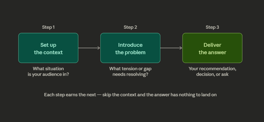
This is not the same as introduction, body, and conclusion. Those are containers, not logic. Presentation structure is about the underlying argument that connects each section. A quick diagnostic: can someone who missed the first five minutes follow the second five without context? If yes, you have a list.
A concrete example: a sales deck that opens with "here's our product, here's how it works, here's pricing" is a list. A sales deck that opens with "your team is spending 12 hours a week on something we can reduce to 90 minutes. Here's how" has a clear story: problem, then solution. Same product, completely different structure, completely different response.
Nancy Duarte, whose firm has worked with Apple, Google, and TED, puts it well in Resonate: the presenter isn't the star. The audience is. Your job is to show them the gap between where things are now and where they could go, then close it. Presentations that fail either never make the problem feel real, or open a problem they never resolve.
For more on sequencing a deck from scratch, the guide on how to create an investor pitch deck walks through real examples from Airbnb, Dropbox, and other funded companies.
Tip 3: How to Start a Presentation: Open With Tension
The most expensive thirty seconds in any presentation are the first thirty. Most speakers spend them introducing themselves, previewing the agenda, and thanking people for being here. That is exactly the wrong way to use the moment when audience attention is highest.
Knowing how to start a presentation well comes down to one thing: create tension before you resolve it. Options that work:
Ask a question the audience doesn't know the answer to
Make a claim that sounds wrong until you explain it
Start mid-story, at the moment something went unexpectedly
What doesn't work: "Hi, I'm [name], today I'm going to walk you through..."
A good test: cover your name and title on your opening slide and then ask whether the first thing you say would still make someone lean in. If the answer is no, rewrite the opening.
Tip 4: How to End a Presentation: Land on Your Sharpest Point
Your last sixty seconds are the most-remembered part of your talk. The audience's attention spikes again at the end, just like it did at the start. Most presenters waste this by summarizing what they just said. Your audience sat through it. They don't need a recap.
End with the one thing you most want them to carry out of the room:
Pitching: make the ask specific. Not "we'd love your support" but "we're raising $2M and looking for a lead"
Recommendation: name the decision. "I'm recommending we pause the campaign and redirect budget to retention. I'd like approval today"
Keynote: end on the line that best captures why any of this matters
Leave "any questions?" to a natural pause. It's fine as a handover, not as a closing statement.
Tip 5: Cut 30% of your planned content
Every presentation contains slides that survived because cutting them felt wrong. The usual culprits:
Background context that doesn't change the conclusion
Data that confirms a point already made twice
Setup slides that add ten minutes to a twenty-minute talk
Cutting 30% almost always makes a presentation stronger. The remaining content lands harder. The practical way to do this: build your deck, then go through it asking one question per slide: "does this change what the audience believes, or just add more?" If it only adds more, cut it. If you're attached to it, put it in an appendix. You can always pull it up in Q&A.
How to Make Slides Look Good: Presentation Design Rules
Slide design directly affects how well your audience follows and retains what you're saying. Cluttered slides split attention. Inconsistent design signals carelessness. A well-designed deck makes the argument easier to follow, not just easier to look at.
The goal isn't minimal slides or plain slides. It's slides where every design decision serves the message. A slide that makes someone stop listening to read it has failed, not because it was too designed, but because the design competed with the content instead of supporting it.
These rules apply whether you're working in PowerPoint, Google Slides, or Keynote. The tool doesn't change the principles. If you want to skip the manual design work entirely, see our round-up of the best AI presentation makers: tools that handle layout, fonts, and consistency automatically so you can focus on the content.
Tip 6: One Idea Per Slide (The Most Violated Rule in Presentation Design)
Every slide should carry one claim, one point, one piece of information. Not "Q3 performance overview" with revenue, churn, headcount, and NPS stacked on a single screen. Not "our approach" with six bullet points explaining a methodology. One slide, one thing.
This is harder than it sounds because it forces a decision most people avoid: what is this slide actually for? When you have to pick one idea, you have to commit to it. "Revenue grew 24%" is a slide. "Here's everything that happened in Q3" is not.
The failure mode I see most often: a presenter puts three related ideas on one slide because they feel like a natural group. The audience reads the second and third while the presenter is still explaining the first. By the time the presenter catches up, half the room is already ahead or behind. One idea per slide eliminates that problem entirely.
Tip 7: Use the 10-20-30 rule as a constraint, not a ceiling
Guy Kawasaki, the venture capitalist who has reviewed more pitch decks than almost anyone alive, popularized this: no more than ten slides, no longer than twenty minutes, no smaller than 30-point font. Most people treat these as maximums. They're better used as targets.
10 slides: hard enough to force real cuts. The discipline is the point, not the number
20 minutes: every presentation I've seen scheduled for an hour could be thirty minutes without losing anything important
30-point font: the most underrated of the three. At 30pt you can't fit more than fifteen words on a slide - which forces you to make a real design decision. One clear headline. One supporting visual. No paragraph of bullets masquerading as a slide.
These rules work because constraints force better design decisions. Unlimited space produces bloated decks.
Tip 8: Replace Bullet Points With a Real Design Decision (Presentation Slide Tips)
Bullet points are a placeholder for a real design decision. When you put them on a slide, the audience reads while you're talking. You lose the room.
The replacement depends on what your content is actually doing:
If you're making a claim, put the claim in one large sentence and use a supporting visual or number below it. "We retained 94% of customers in Q3" on a slide, with a line chart below it, is cleaner and more memorable than six bullets about retention initiatives.
If you're showing a process, use a horizontal flow diagram. Steps 1, 2, 3 in boxes reads faster than a bulleted list of the same steps.
If you're comparing options, use a side-by-side table. Two columns with clear headers communicate comparison better than a nested bullet list.
When bullets are genuinely the right format (a list of requirements, a set of criteria), apply the 6x6 rule: no more than six lines, six words per line. This forces you to write assertions instead of sentences, and makes it physically impossible to read the slide aloud word for word.
Tip 9: Good Presentation Slide Design Is Also About Consistency, Not Just Creativity
The most common problem in presentation slide design is not bad aesthetics. It's inconsistency. Different fonts on different slides. A color that changes mid-deck because one slide was copied from another presentation. Headings that are 36pt on some slides and 28pt on others. The audience doesn't consciously notice any of this, but they feel it as a lack of craft, and it transfers subconsciously to the content.
The fix is simpler than most people think. Before you add a single slide:
Pick one template and set it up in the slide master
Two to three colors maximum
One font family, one weight for headings and one for body
Every slide built inside that system
The goal: someone could shuffle your slides randomly and still recognise them as part of the same deck.
Then do the back-row test: stand three feet from your screen and check if every slide is still readable. A 20-point font that looks fine at a desk is invisible to the person at the back of a conference room. High-contrast text on a simple background always wins over light-on-light or text layered over busy images.
For more on the design decisions around spacing, how to direct the reader's eye, and whitespace that separate professional slides from generic ones, the guide to making AI slides that look designer-made covers this in depth.
Tip 10: Treat every data slide as a design problem
Most data slides fail before anyone reads them because the presenter pasted a table directly from Excel and moved on. A table with twelve columns and nine rows is not a slide. It's a spreadsheet with a presentation theme applied to it. The audience can't read it from across the room, and even if they could, they'd have to do the analytical work themselves to find the point.
For every data slide:
Title = the finding, not the category. "Enterprise grew 31% while SMB declined 8%" not "Q3 revenue by segment"
One chart, one highlighted data point, not the full dataset
Color directs the eye to what matters; everything else is grey or a different color
Strip everything non-essential: gridlines, excess labels, decimals. If removing it doesn't break the chart, remove it
Cole Nussbaumer Knaflic, who built Google's data visualization program and wrote Storytelling with Data, calls this clearly: "simple beats sexy." Every element you add to a chart is one more thing the audience has to process. Most data slides fail because the presenter goes straight from their spreadsheet to the slide without deciding what the data actually means. They're showing their work instead of their conclusion.
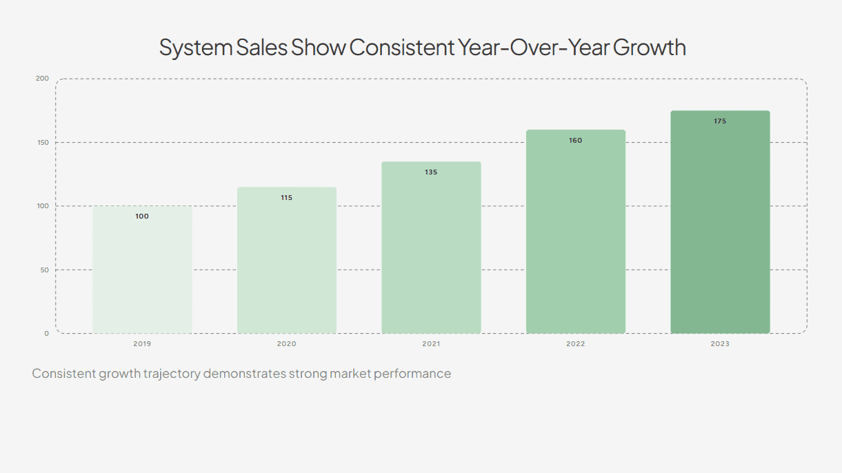
For example, this slide focuses on a clear title summarising the data while the bars are colored in a way to direct attention to the current (and also best performing) year.
How to Present Well: Delivery Rules That Change the Room
This is the section most people skip. Knowing how to present ensures that all the effort you put into the content and design is noticed by the audience.
Tip 11: Rehearse Out Loud: This Is the Most Important Delivery Habit
Reading your slides in your head is not rehearsal. Your mouth needs to learn the material separately from your eyes. The first time you say any sentence out loud is almost always the worst version of it: the phrasing is off, the pause is in the wrong place, the transition from one slide to the next doesn't quite work. By the third full run-through, you've found the natural rhythm, cut the "ums" at the logic gaps, and stopped needing to glance at the slide to remember what comes next.
Do three full run-throughs minimum, standing up, out loud:
Once alone: find the sentences that come out wrong and the transitions that don't land
Once with someone honest: not someone who says "pretty good," but someone who tells you exactly where they got bored
Once timed to the second, not approximately. You need to know if you're running over
Rehearsal also reveals a specific problem nothing else catches: if you can't explain a slide fluently without it in front of you, you're not ready to present it.
Tip 12: Slow down and learn to use silence
Almost every nervous presenter speeds up. The faster they talk, the more in control they feel. The audience experiences the opposite: a torrent of information with no room to process any of it. Deliberately slowing down feels wrong from the inside and looks composed from the outside.
The technique: pause for two deliberate seconds after every key point. The audience hears the claim, the pause signals that it mattered, and they absorb it before the next sentence arrives. From where they're sitting, silence reads as confidence.
Rule 13: Look at the audience, not the screen
This is the most observable marker of an inexperienced presenter: they turn to look at their own slides mid-sentence. The moment they do, the audience's attention follows the presenter's eyes to the screen. The thread between presenter and audience breaks.
The technique:
Pick one person, hold eye contact for a full thought (two to three seconds)
Move to someone else. Don't scan, don't stare at the back wall
Repeat around the room
It takes about ten presentations to feel natural. The discomfort is a calibration issue, not a talent issue.
When your eyes stay on the room, the dynamic shifts from broadcast to conversation.
Tip 14: Create one moment of interaction early
Audience engagement doesn't require games, breakout groups, or elaborate activities. It requires one thing: a moment within the first few minutes where the audience does something other than passively receive. Answers a question. Raises a hand. Considers a specific scenario you've put in front of them. That one moment changes the dynamic for the rest of the talk.
Once someone responds, even just raising a hand, they've made a small commitment. That shifts the whole dynamic.
The simplest version: ask a genuine question in the first three minutes. "How many of you have been in a meeting where you couldn't figure out what decision was being made?" is better than any amount of throat-clearing about your background. It immediately tells the audience this presentation is relevant to them.
Tip 15: How to Calm Nerves Before a Presentation: Manage Them Before You Walk In
Between 15% and 30% of people experience significant public speaking anxiety. If that's you, the worst thing you can do is try to suppress it in the moment. Nerves during a presentation are nearly impossible to hide and actively make things worse the more you focus on them.
The useful reframe: nerves are physical arousal, the same mechanism as excitement. They're a sign the presentation matters to you, not a sign you're unprepared. The goal is to redirect the energy, not eliminate it.
Three things that reliably work for how to calm nerves before a presentation, in order of when to do them:
The night before: over-rehearse the first 30 seconds. The opening is when anxiety peaks. If those 30 seconds are completely automatic, you can start on autopilot and your nervous system settles once you're through the hardest part.
Morning of: warm up your voice. Hum. Speak full sentences out loud in a normal volume. Your voice will settle into its natural register instead of starting tight and slightly strangled.
Before you walk in: arrive early and stand in the room alone. Walk to the front. Look at where the audience will be. Sit in their seats and look toward where you'll stand. The physical environment stops being unfamiliar, and that familiarity takes the edge off before anyone else arrives.
How to Make a Good PowerPoint Presentation: Specific Tips
Most of the tips in this guide apply to any slide tool. But PowerPoint has specific defaults that work against you, and knowing how to override them is worth covering separately. These are the PowerPoint presentation tips that make the biggest practical difference.
Use the Slide Master before you start. PowerPoint's Slide Master (View > Slide Master) lets you set your fonts, colors, and layout once and have them apply to every slide automatically. If you skip this and style slides individually, you'll end up with inconsistencies: different heading sizes, fonts that drift, spacing that doesn't match. Set the master first. Everything else follows from it.
Set your font to 28–32pt minimum. PowerPoint defaults to font sizes that look fine on your laptop and are unreadable from ten feet away. Treat 30pt as your floor. If you can't fit your text at that size, there's too much text.
Turn off AutoFit. PowerPoint's AutoFit feature automatically shrinks text to fit a placeholder. This means you can keep typing past the point where the slide is readable and PowerPoint will silently make the font smaller. Turn it off (right-click the text box > Format Shape > Text Options > do not autofit). When the text won't fit, that's a signal to cut, not to shrink.
Delete slides you're not presenting. PowerPoint keeps all slides in the file even when hidden. Before presenting, go through the deck and delete anything you're not actively using rather than just hiding it. Hidden slides create confusion if you accidentally advance past them during Q&A.
Export as PDF before any important presentation. Fonts render differently on different machines. A deck that looks correct on your laptop may have broken fonts or shifted layouts on the conference room computer. Export to PDF the night before as a backup. Or use a tool like Alai that handles consistent export automatically.
For a broader comparison of tools, the best AI presentation makers guide covers which tools handle formatting and consistency automatically, which matters if you're building decks frequently.
Good Presentation Examples: What the Tips Look Like in Practice
Tips are easier to apply when you can see what they look like in real decks. Here are three formats with specific structural observations.
Example 1: A pitch deck
The most common mistake isn't covering the wrong content - it's covering it in the wrong order.
What works:
Open with the problem, stated in numbers. Airbnb's original deck opened with one sentence and a simple pricing grid. Problem established in under ten seconds.
Every slide after that answers a question the previous slide created: problem → why existing solutions fail → our solution → traction → market → team → ask
Each slide either raises investor interest or answers the last question. If it does neither, cut it.
What doesn't work:
Opening with "about us" or a product feature tour
Saving the ask for the last slide with no build toward it
Including slides (10-year projections, extensive background) that don't move the investor closer to yes
Browse 100+ real pitch decks from funded startups at Alai's pitch deck examples library — filterable by slide type so you can see how different companies handle the problem slide, traction slide, or the ask.
Example 2: A business update or quarterly review
The failure mode is almost always sequence.
What works:
Open with the conclusion: "We missed Q1 revenue by 14% and we know why"
Every slide that follows is explanation, not suspense
End with a specific recommendation and the decision you need
What doesn't work:
Chronological tour of results (January, February, March...) with the conclusion saved for the end
Presenting data without telling the audience what to make of it
Ending with "any questions?" instead of naming the decision
Example 3: A sales or client presentation
Most sales decks are product tours. The audience waits the whole time for the presentation to become about them.
What works:
Open with something specific to this client. Not "companies like yours struggle with X" but: "based on your discovery call, your team is spending 11 hours a week on X"
That number on the first content slide reframes everything that follows as their solution, not your product
Your takeaway sentence should be "Acme Co should buy this because it solves the specific problem they told us about"
What doesn't work:
Opening with your company history or a product feature list
Generic industry pain points that could apply to anyone
A takeaway sentence that reads "our product does these things"
Key Takeaways
The fastest way to get better at how to make a good presentation is repetition with intention. Apply one rule per talk at first. Presentation skills compound. Every effective presentation you give makes the next one easier.
Content first. Define your single takeaway sentence before opening any slide software. Everything else, design and delivery, is in service of that one idea.
Structure is argument, not containers. Situation, problem, answer. The audience should feel pulled forward through a story, not walked through a list.
One idea per slide is the highest-leverage design change most presenters can make. It forces you to decide what actually matters.
Rehearse out loud, at least three times. Reading slides in your head is not preparation. Your mouth needs to know the material separately.
Manage nerves before the room, not in it. Over-rehearse your first 30 seconds, warm up your voice, and arrive early enough to own the space.
Frequently Asked Questions
What is the 5-5-5 rule for presentations?
The 5-5-5 rule limits slides to five words per line, five lines per slide, and no more than five text-heavy slides in the full deck. The reasoning is simple: people can't read and listen at the same time, and the 5-5-5 rule forces content density down to a level the audience can actually process. In practice, it works best as a diagnostic for early drafts: if your slides routinely break this rule, the slides are carrying too much and you're doing too little of the work verbally.
What is the 7-7-7 rule for presentations?
The 7-7-7 rule caps slides at seven lines of text, seven words per line, and seven slides total. It's a slightly more lenient version of the 5-5-5 rule and less aggressive than Kawasaki's 10-20-30 framework. All three rules exist to solve the same underlying problem: presenters who overload slides with text and then read them aloud. If I had to recommend one working constraint, the 10-20-30 rule wins because each of its three numbers targets a different dimension: slide count, time, and readability.
How do you start a good presentation?
Open with something that creates immediate engagement: a specific question the audience doesn't have the answer to, a counterintuitive claim about your topic, or a very short story that ends somewhere interesting. The introduction and agenda can come in the second minute, after you've established that there's a reason to pay attention. The first thirty seconds are when audience attention peaks.
What are 5 qualities of a good presentation?
A clear single message, logical structure that builds toward a conclusion, high visual quality in the slides, confident and paced delivery, and an opening that earns attention before asking for it. These five qualities appear consistently across good presentations regardless of topic, context, or format. Notice that "beautiful design" isn't on the list. Strong design supports a presentation, but it doesn't compensate for weak structure or unclear thinking.
How long should a good presentation be?
Research and experienced presenters point consistently to 18 to 20 minutes as the optimal range for attention and retention. The TED format runs 18 minutes for exactly this reason: long enough to develop an argument, short enough that the audience commits fully knowing there's a defined end. Most business presentations run longer than they need to. If your talk is scheduled for 45 minutes, ask honestly whether it could be 25. The answer is almost always yes, and the 25-minute version will almost always land better.
How do you make a presentation more engaging?
Three things that reliably increase engagement: ask a genuine question early and give the audience a moment to respond; use concrete examples rather than abstract claims; build toward a point rather than listing facts in sequence. An audience should feel pulled forward through a talk, not walked through it slide by slide. Curiosity is the mechanism: give them something to wonder about, then resolve it.
What is the most common mistake in presentations?
Treating the slides as the presentation. The moment you start reading slides aloud, you've lost the room. Slides are a visual aid. They exist to support what you're saying, not to contain it. This is especially applicable when you're pitching your presentation rather than sharing it.
Does font size really matter in presentations?
Yes, and in a more practical way than most people realize. A 20-point font looks readable on your laptop. In a conference room, the person at the back cannot read it. The 30-point minimum from the Kawasaki rule exists for this reason: it prevents small text, forces you to cut word count, and ensures the slide reads from across the room. Sans-serif fonts like Inter, Helvetica, and Arial tend to be cleaner at presentation distances. These rules apply whether you're figuring out how to make a good PowerPoint presentation or working in Google Slides or Keynote. The tool doesn't change the physics of readability. If you want to know how to make a good PowerPoint presentation specifically, the answer is: follow these same rules inside PowerPoint's slide master, and let the constraints do the work.
PAGES
Compare Tools
resources
